Rillaz
COURONNÉ
ARTISTIC DIRECTION / GLOBAL DESIGN
We were contacted by the Toulouse rapper Rillaz to create the artistic direction and visual supports
for his first album COURONNÉ. From the development of the first concepts to the production of his
first clip, including the management of his social networks, we have supported him throughout the
promotion of his project.
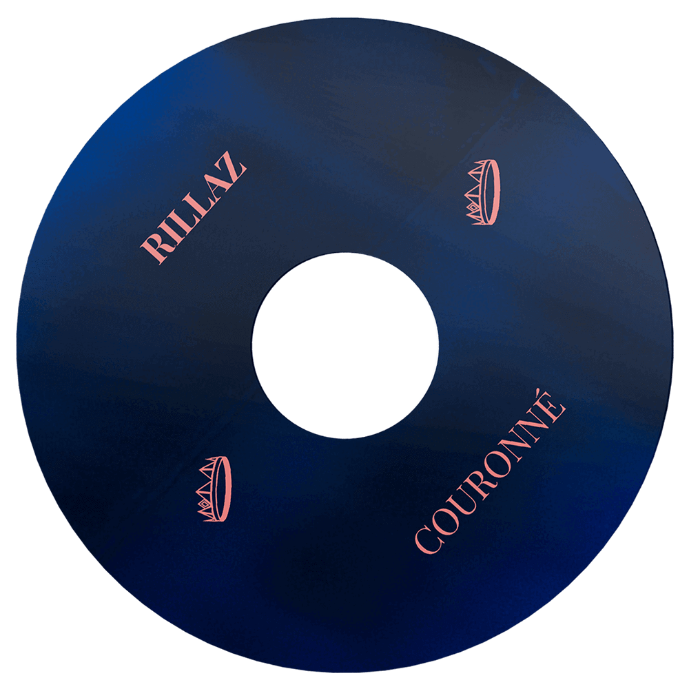
COURONNÉ is a pictorial, conceptualized album which aims to be listened to in its entirety, like a
passing day, with its changes of vibe and colors. Each sound has a universe of its own, hence our
desire to have radically different graphic styles from track to track.


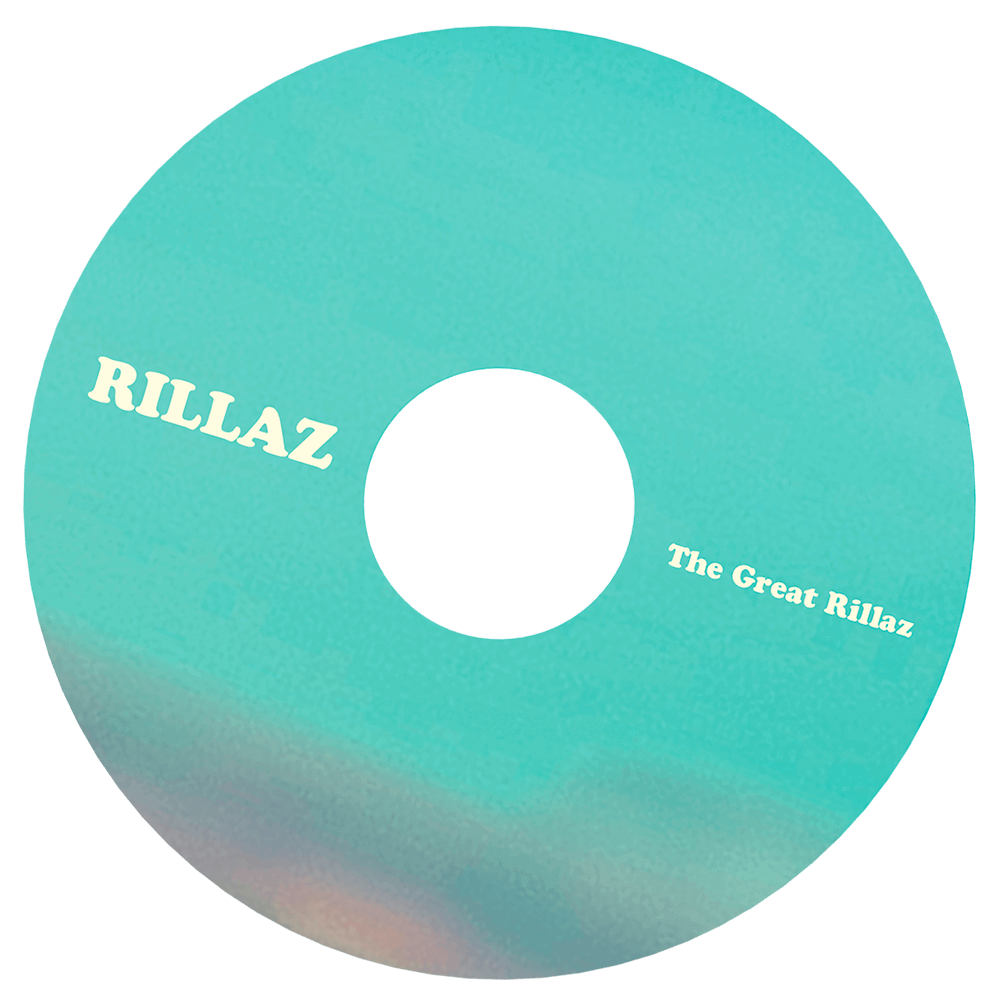

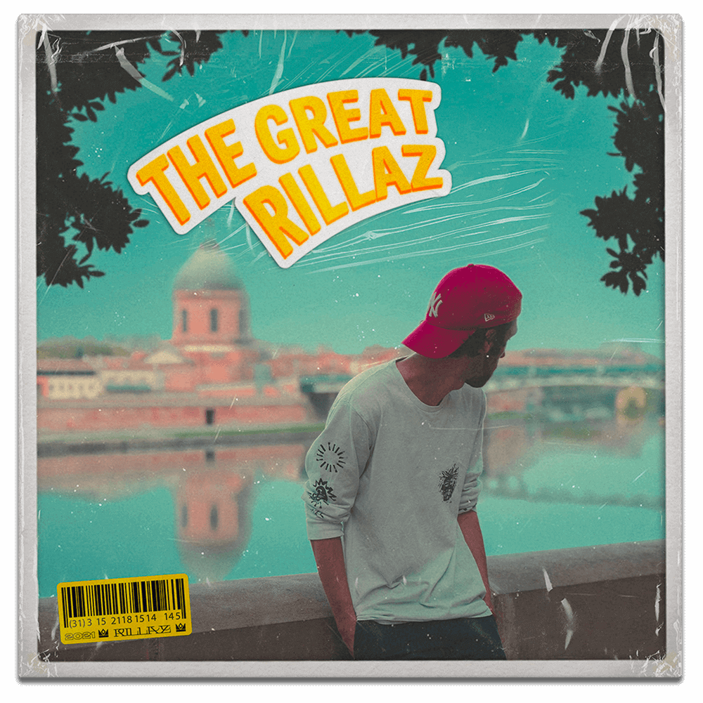


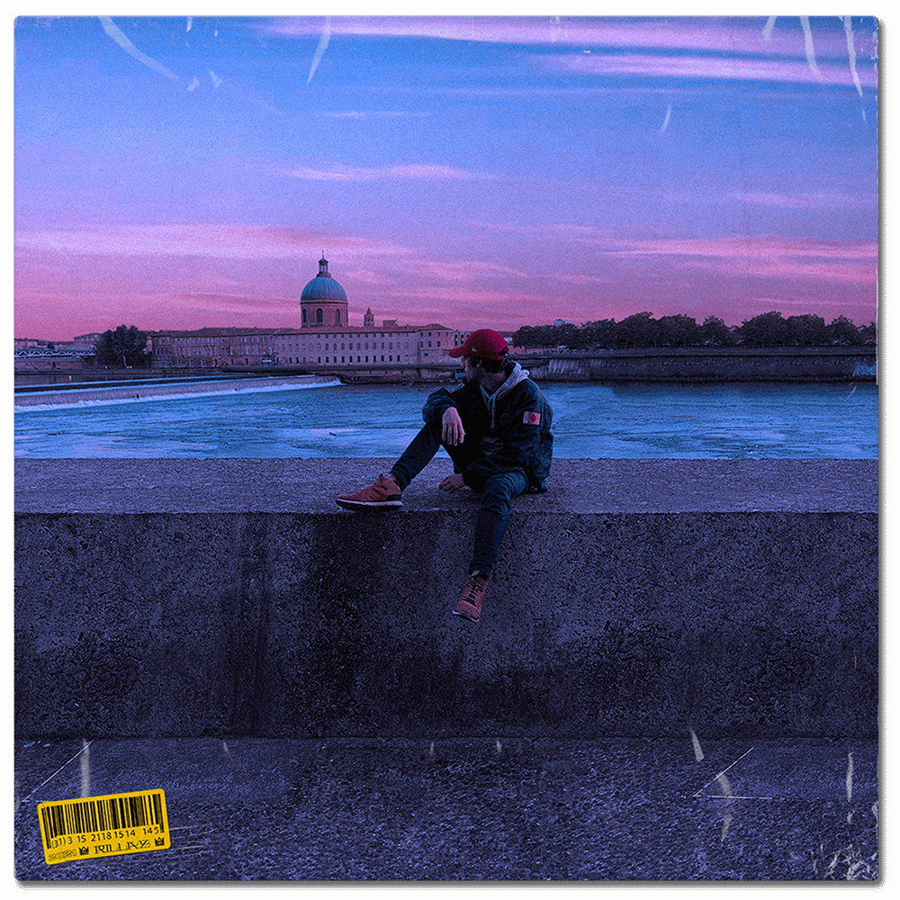
The visual is intended to be intriguing, one wonders if the picture was taken at dawn or at dusk.
Is this the introduction or the conclusion of the album?
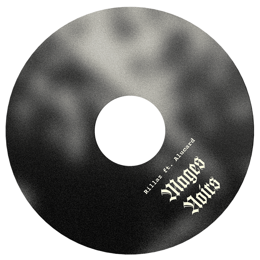
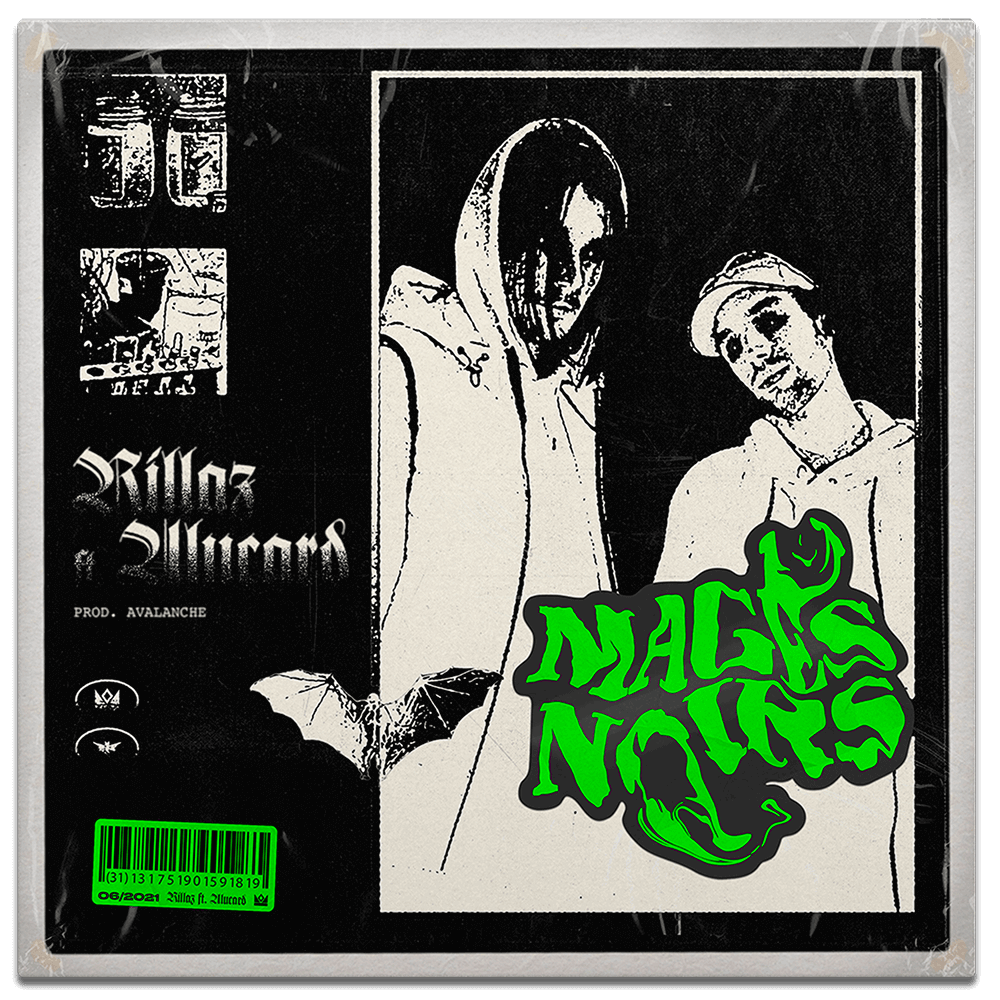
Radical change of mood to stick to a darker, more aggressive and oppressive single. The cover art is
very dark, it is directly inspired by the visuals of independent punk and black metal bands from the
90s.
The very raw textures and the complexity of reading the information underline the aesthetic of
the sound.
The shoot for this single took place in the same location as the one for the album, but a little
further away and at a different time of day, as if Rillaz was moving forward in space and time.
The atmosphere is warmer and more summery, in line with the sounds of the track


The artistic direction of this album is based on a very important focal point for Rillaz; in his project, he puts his words, his flows, his atmospheres, his musicality, like so many elements of life put on a table. It is around this focus that we wanted to create compositions of complex and detailed elements, like this album. We used these compositions to “visualize” the songs on YouTube as well as to promote the project on Instagram. So the audience can look at and listen to COURONNÉ.
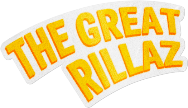
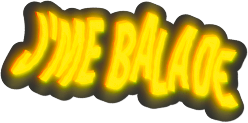


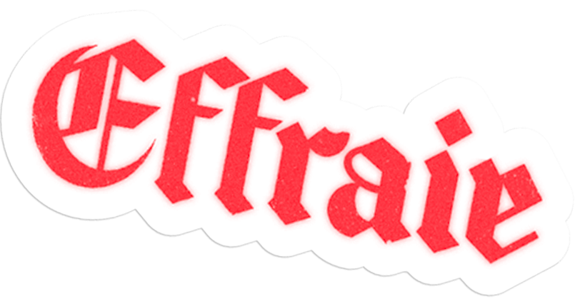
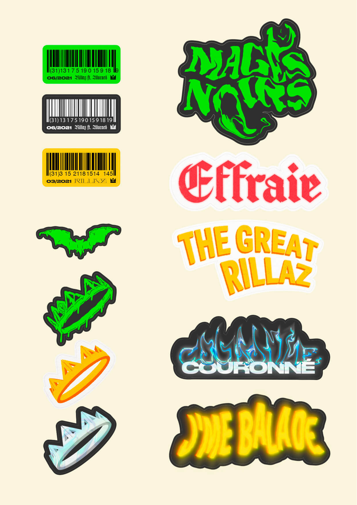
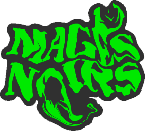
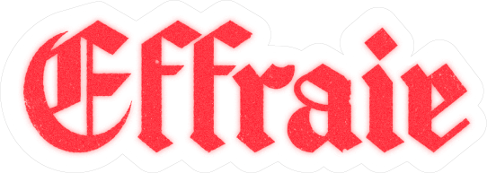
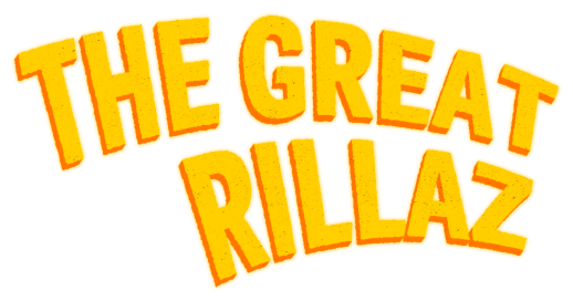
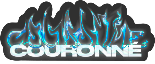
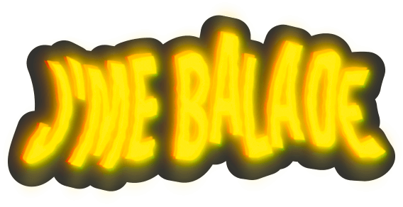
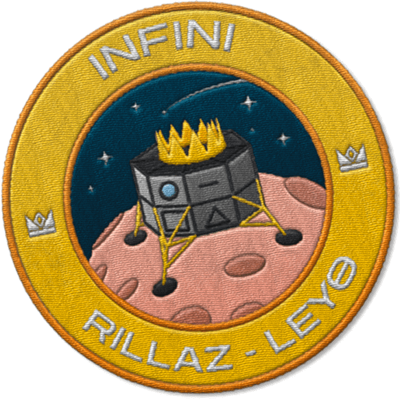
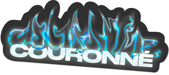
To visually reinforce each universe of the project, we have created typographic logos, available in the form of stickers and titles, which can be found on the covers as well as on promotional compositions for Instagram.
We started with a simple typographic base with serifs reminiscent of old grimoires. The distortion and color of this logo refer directly to potions and witchcraft.
In this title we have pushed the duality between passion and violence. Indeed, the use of a rounded Gothic typography as well as this color, between blood red and the red of love directly echoes this duality.
As the tracks were meant to be unfolding as a typical day in Rillaz’s life, the intent for this logo was to focus on this “episode” concept. It refers directly to cartoons’ titles from the 1950s.
We wanted to graphically represent the modern tones and the incandescent atmosphere of the tracks with a simple typography contrasted with a "melted metal" effect, like a processor that would have overheated.
Continuing on from the album, this track appears as the follow-up to The Great Rillaz's day. We therefore adopted the same typographic style by applying chromatic aberration and distortion symbolizing the alcoholic scent of an evening.


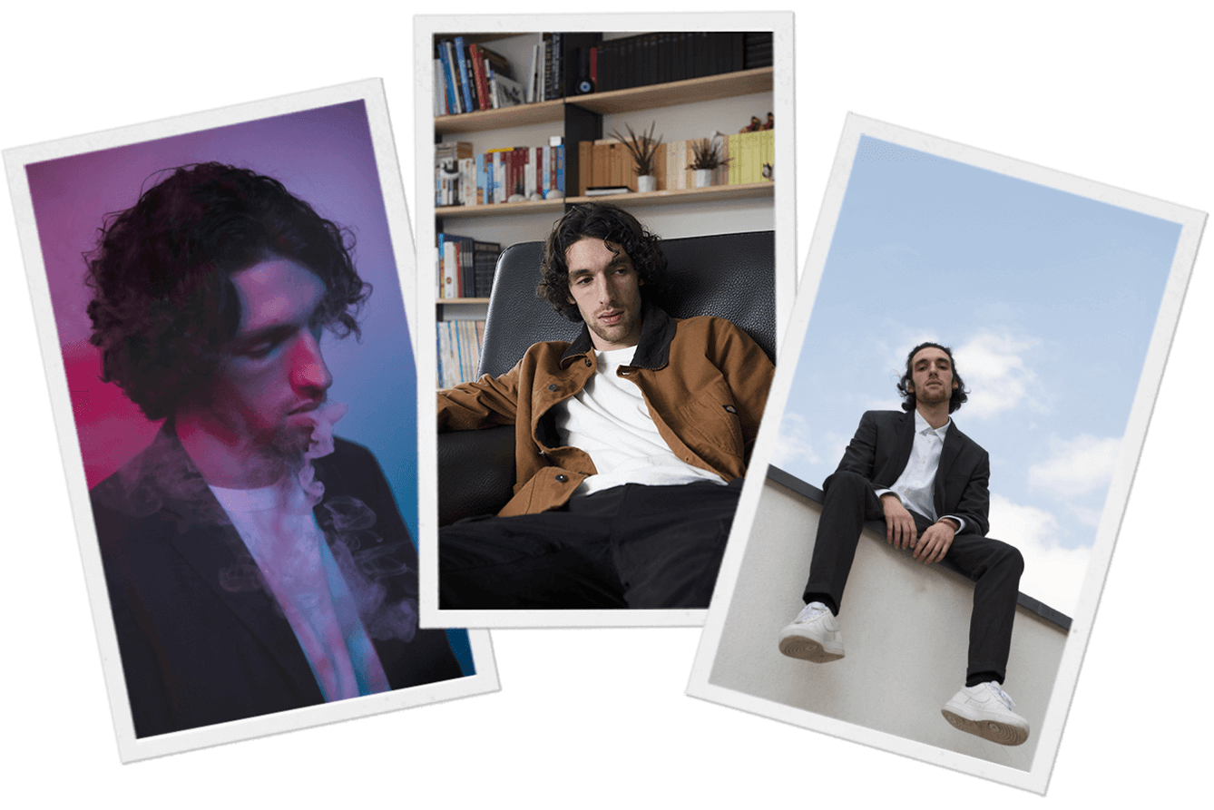
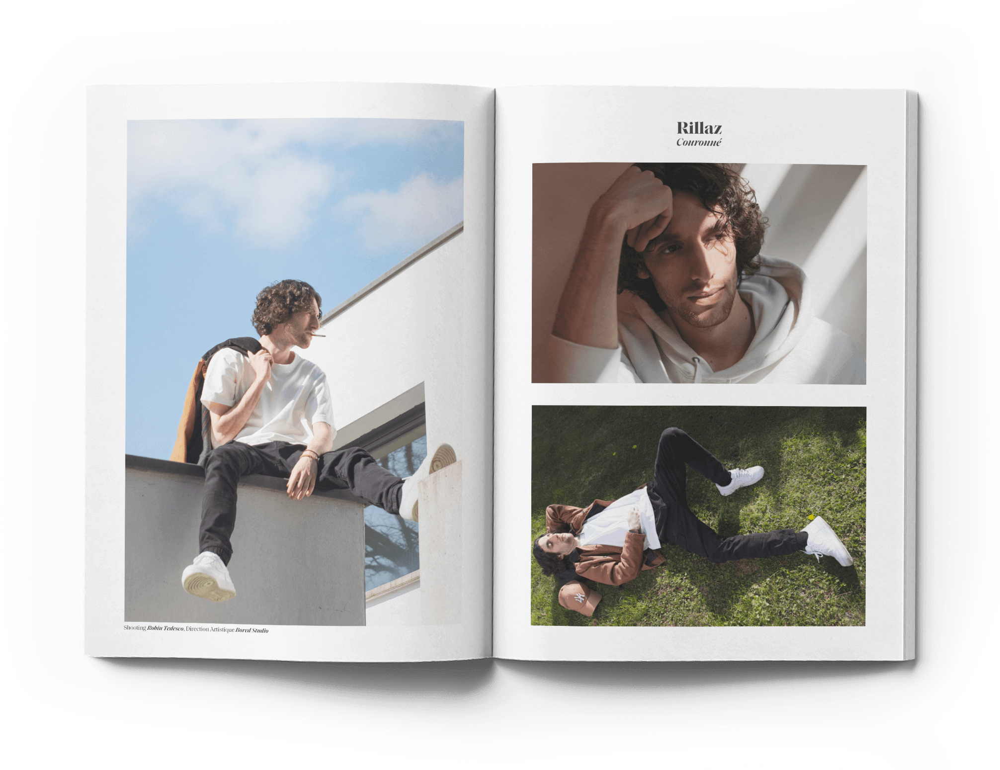
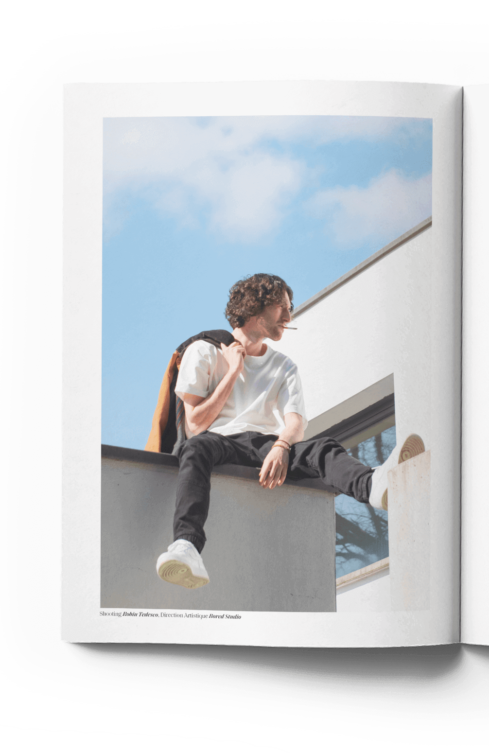
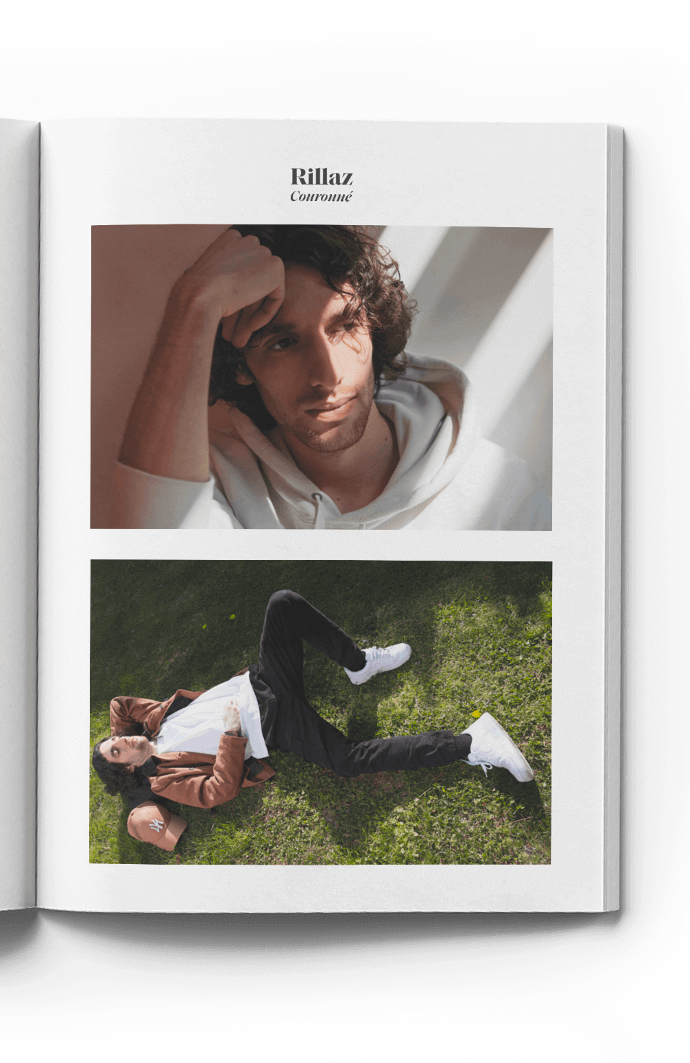
For one day, we managed the artistic direction for a shoot in a Toulouse villa.
MAGES NOIRS
CLIP
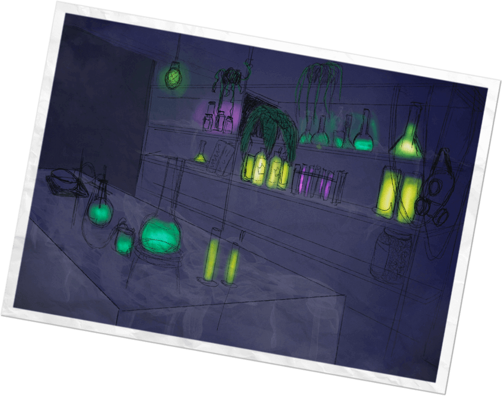
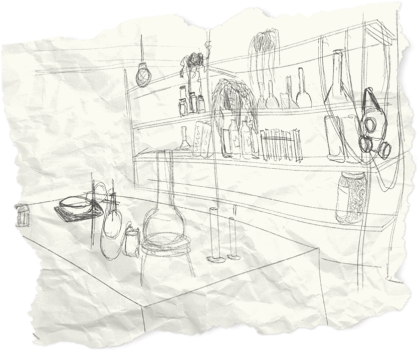
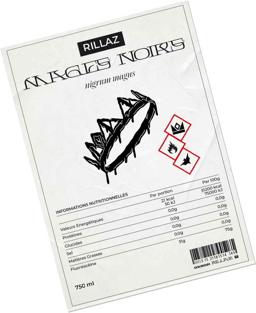
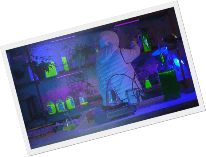
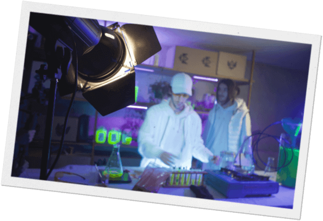
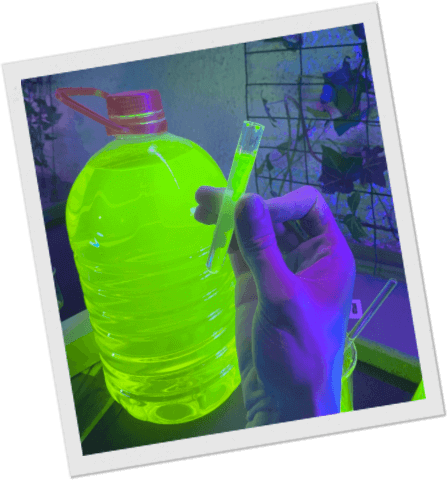
We have thought, produced and directed the clip for Rillaz featuring rapper Alucard. The goal was to create 3 different settings in one location, so that the entire clip could be shot in one day. Based on the storytelling of the clip, we created a clandestine laboratory, as well as a warehouse and a living room that we made impacting on the screen by working with fluorescent chemicals as well as UV light. We took care of every little detail of the clip, from the choice of outfits to the design of the packaging for the setting.
Rillaz
COURONNÉ
ARTISTIC DIRECTION / GLOBAL DESIGN
We were contacted by the Toulouse rapper Rillaz to create the artistic direction and visual supports
for his first album COURONNÉ. From the development of the first concepts to the production of his
first clip, including the management of his social networks, we have supported him throughout the
promotion of his project.
COURONNÉ is a pictorial, conceptualized album which aims to be listened to in its entirety, like a
passing day, with its changes of vibe and colors. Each sound has a universe of its own, hence our
desire to have radically different graphic styles from track to track.


The visual is intended to be intriguing, one wonders if the picture was taken at dawn or at dusk.
Is this the introduction or the conclusion of the album?
Radical change of mood to stick to a darker, more aggressive and oppressive single. The cover art is
very dark, it is directly inspired by the visuals of independent punk and black metal bands from the
90s.
The very raw textures and the complexity of reading the information underline the aesthetic of
the sound.
The shoot for this single took place in the same location as the one for the album, but a little
further away and at a different time of day, as if Rillaz was moving forward in space and time.
The atmosphere is warmer and more summery, in line with the sounds of the track.

The artistic direction of this album is based on a very important focal point for Rillaz; in his project, he puts his words, his flows, his atmospheres, his musicality, like so many elements of life put on a table. It is around this focus that we wanted to create compositions of complex and detailed elements, like this album. We used these compositions to “visualize” the songs on YouTube as well as to promote the project on Instagram. So the audience can look at and listen to COURONNÉ.


To visually reinforce each universe of the project, we have created typographic logos, available in the form of stickers and titles, which can be found on the covers as well as on promotional compositions for Instagram.
We started with a simple typographic base with serifs reminiscent of old grimoires. The distortion and color of this logo refer directly to potions and witchcraft.
In this title we have pushed the duality between passion and violence. Indeed, the use of a rounded Gothic typography as well as this color, between blood red and the red of love directly echoes this duality.
As the tracks were meant to be unfolding as a typical day in Rillaz’s life, the intent for this logo was to focus on this “episode” concept. It refers directly to cartoons’ titles from the 1950s.
We wanted to graphically represent the modern tones and the incandescent atmosphere of the tracks with a simple typography contrasted with a "melted metal" effect, like a processor that would have overheated.
Continuing on from the album, this track appears as the follow-up to The Great Rillaz's day. We therefore adopted the same typographic style by applying chromatic aberration and distortion symbolizing the alcoholic scent of an evening.
To visually reinforce each universe of the project, we have created typographic logos, available in the form of stickers and titles, which can be found on the covers as well as on promotional compositions for Instagram.


For one day, we managed the artistic direction for a shoot in a Toulouse villa.


MAGES NOIRS
CLIP
We have thought, produced and directed the clip for Rillaz featuring rapper Alucard. The goal was to create 3 different settings in one location, so that the entire clip could be shot in one day. Based on the storytelling of the clip, we created a clandestine laboratory, as well as a warehouse and a living room that we made impacting on the screen by working with fluorescent chemicals as well as UV light. We took care of every little detail of the clip, from the choice of outfits to the design of the packaging for the setting.


PHOTOSHOOTING
For one day, we managed the artistic direction for a shoot in a Toulouse villa.


MAGES NOIRS
CLIP
We have thought, produced and directed the clip for Rillaz featuring rapper Alucard. The goal was to create 3 different settings in one location, so that the entire clip could be shot in one day.
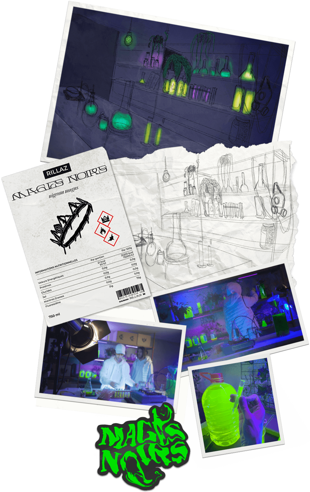
Based on the storytelling of the clip, we created a clandestine laboratory, as well as a warehouse and a living room that we made impacting on the screen by working with fluorescent chemicals as well as UV light. We took care of every little detail of the clip, from the choice of outfits to the design of the packaging for the setting.

